Exploring Industrial Pollution in the US
This mapping project is a directed narrative told through a storytelling map format that visualizes the general location and distribution of Superfund sites and TRI reporting facilities. The user is then guided through several case studies augmented with additional data sources that explore the wider reach and context of these sites. The project presents maps created with Mapbox GL JS and uses the Scrollama JavaScript library to create a storytelling experience. More information can be found on Github.
Pedestrian Signals in Nashville TN
This project uses Node.js and npm packages to automate a workflow for processing data. The processed data is displayed in a thematic web map with a legend that provides basic coordinated visualization with map features, and uses a marker cluster plugin to aggregate point features. Data acquired from Nashville Open Data Portal: Council District Outlines and Pedestrian Signal Inventory and ADA Self-Assessments. Map created with Leaflet. More information can be found on Github.
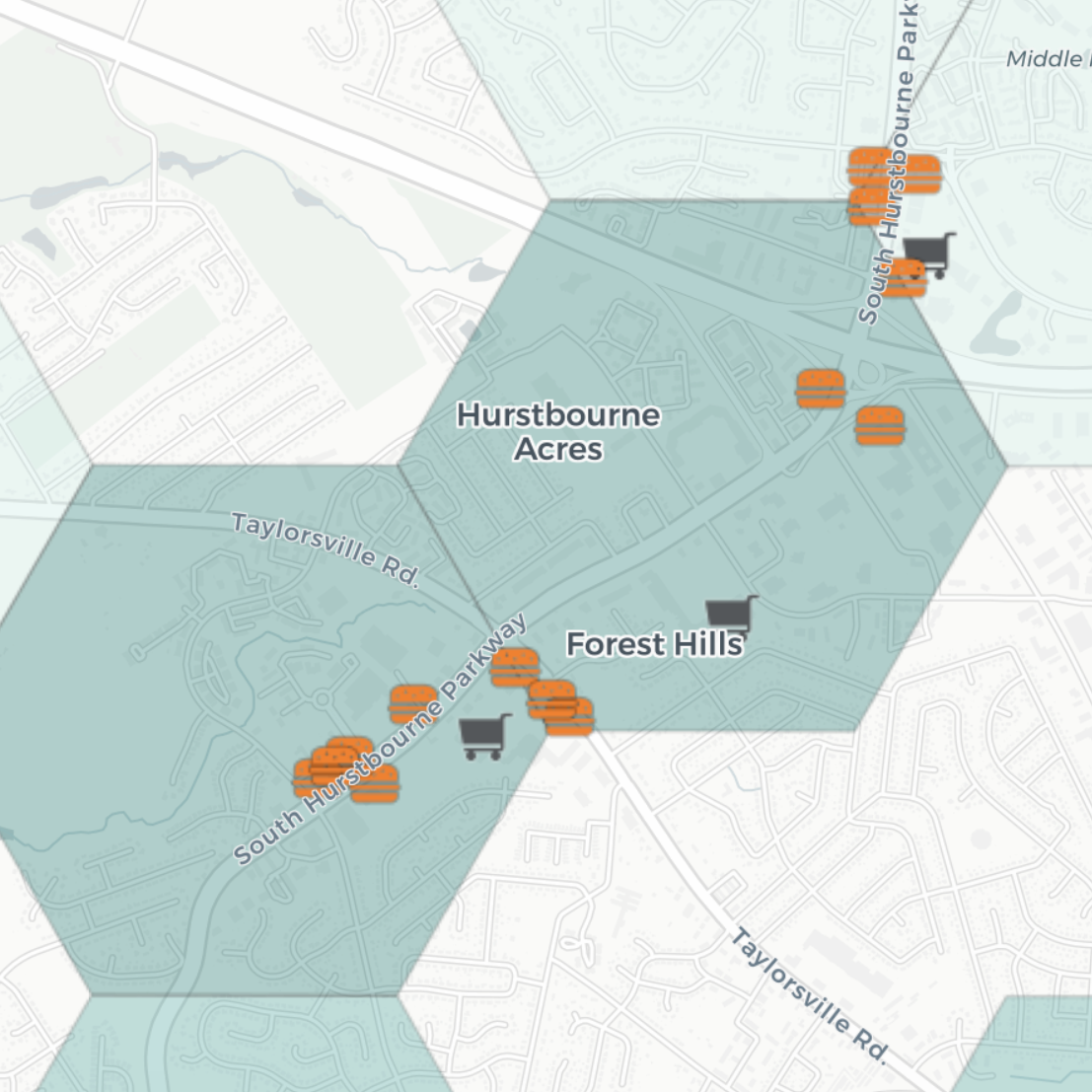
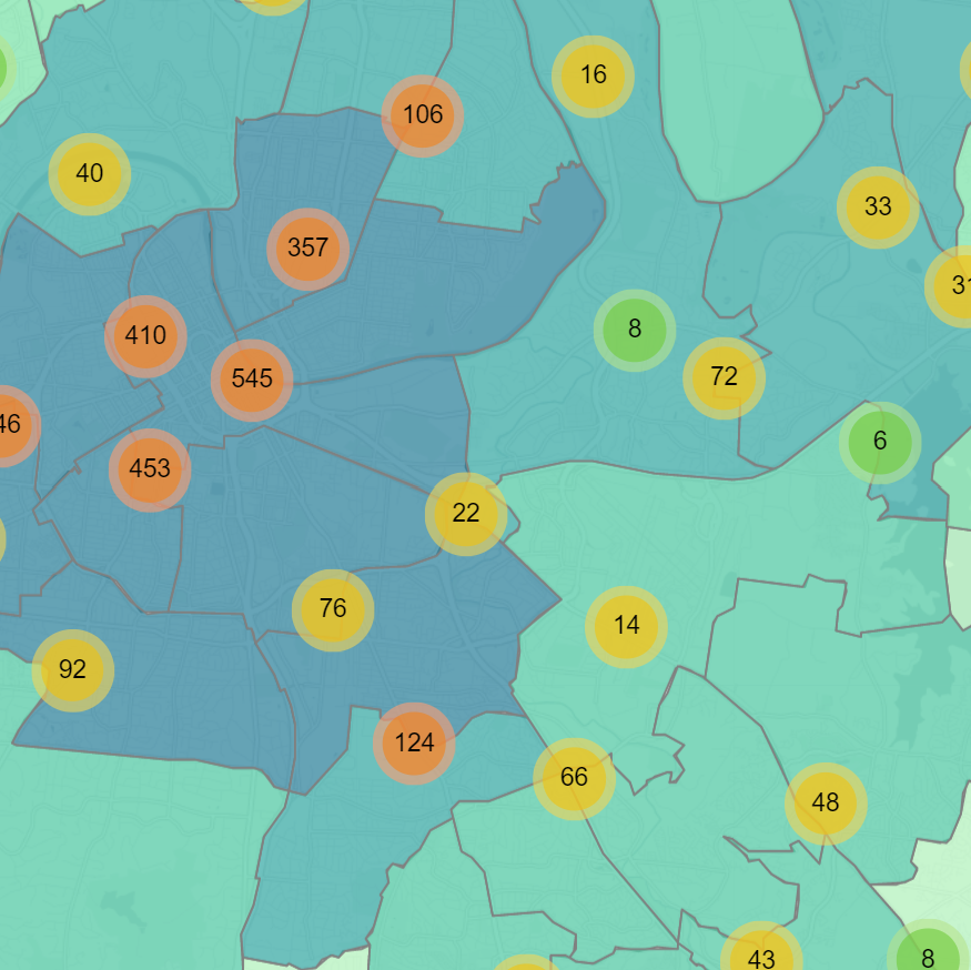
Mapping Food Swamps
A food swamp is an area that is densely populated with fast food while also having a low concentration of grocery stores or supermarkets. This map shows grocery stores/supermarkets and fast food restaurants/convenience stores in Kentucky, aggregated by 20-mile and 1-mile hexagons. Hexagons are symbolized using a divergent color scheme to show whether an area has a higher concentration of fresh-food or fast-food options. All data downloaded from OpenStreetMap, prepared in QGIS, and mapped in CARTO.
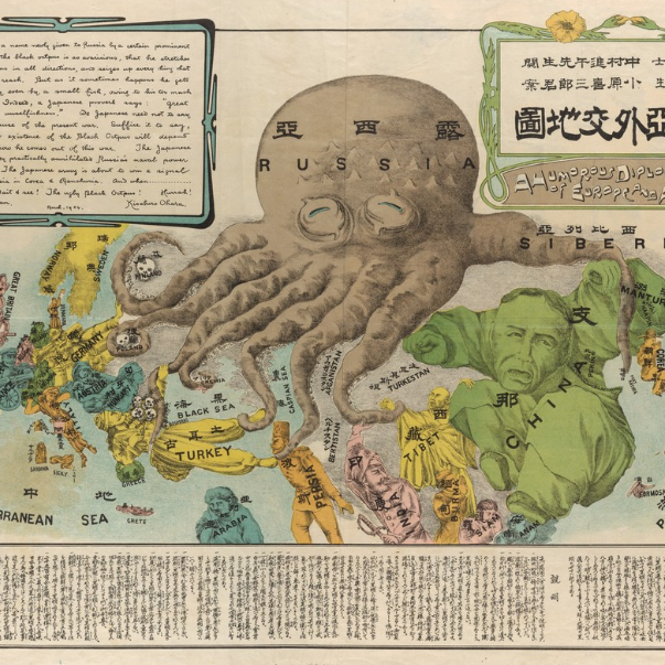
Persuasive Cartography Study
This project showcases four examples of persuasive cartography, and guides the reader through each to explore their persuasive elements. The digitized historic maps are hosted through IIIF by the Cornell University Library Digital Collections and the Norman B. Leventhal Map & Education Center at the Boston Public Library Digital Collections. The web-based interactive was constructed using a Bootstrap framework and the Leaflet-IIIF package.
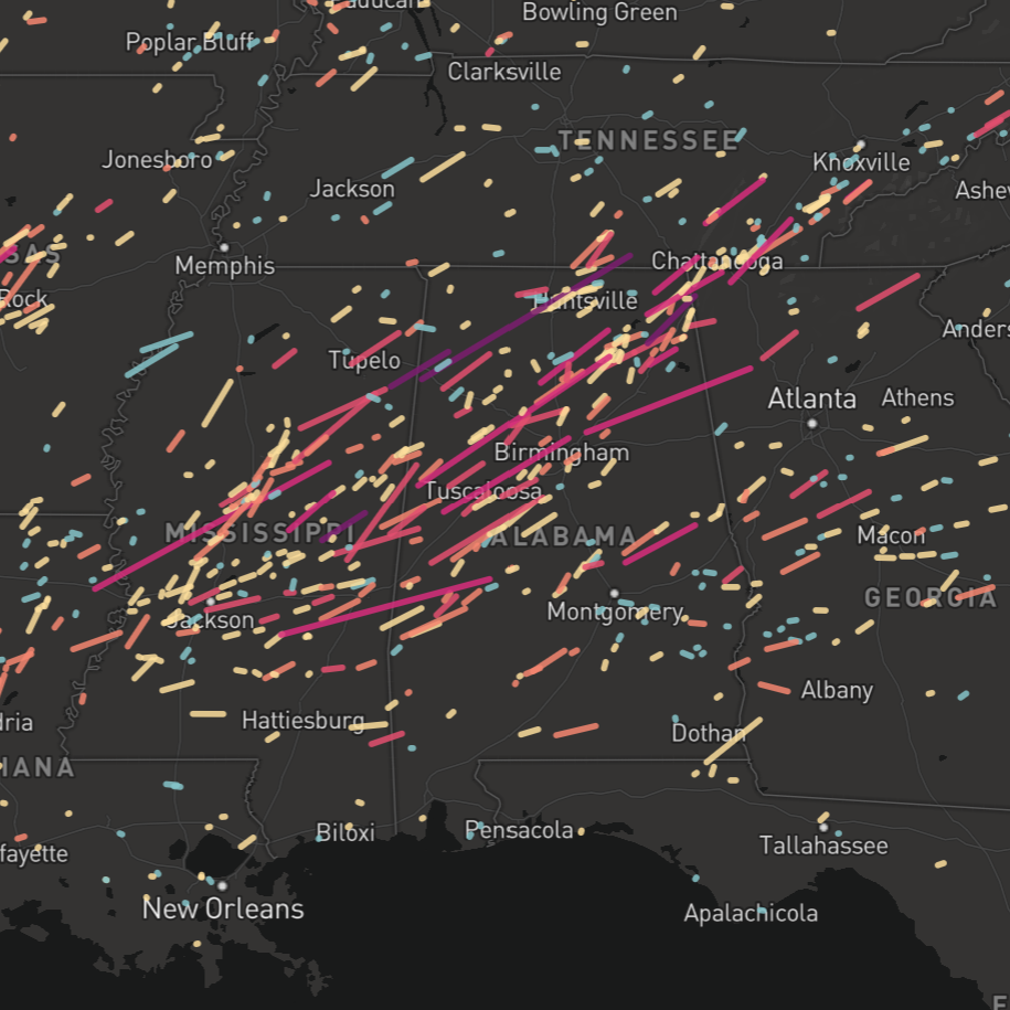
Tornado Damage in the US: 2010-2018
This map was created as part of the New Maps Plus program to experiment with Mapbox GL JS. It shows tornado paths in the US from 2010 to 2018, and makes use of several examples from the Mapbox GL JS API Documentation. Data acquired from NOAA. More information can be found on Github.
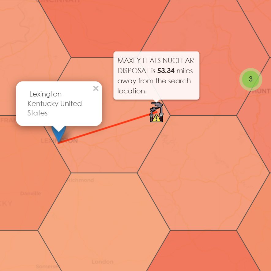
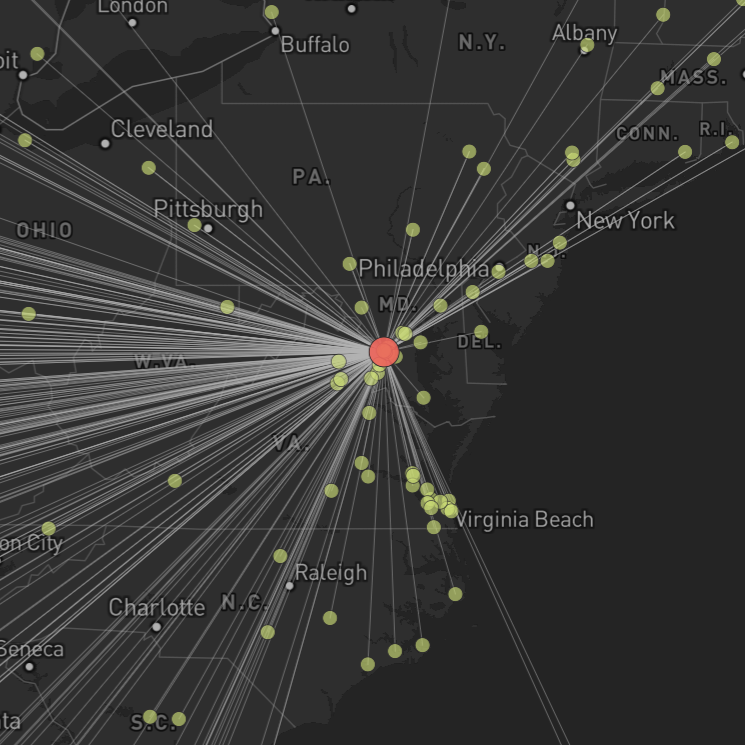
How close do you live to a toxic Superfund site?
This project uses Turf.js and other npm packages and command line tools within a Node environment. JS scripts were used to process and analyze two datasets and write output JSON files for plotting in an interactive web map. The final web map is created with Leaflet and uses several plugins for visualization and interaction. Data was acquired from USGS and the US Government Accountability Office. More information can be found on Github.
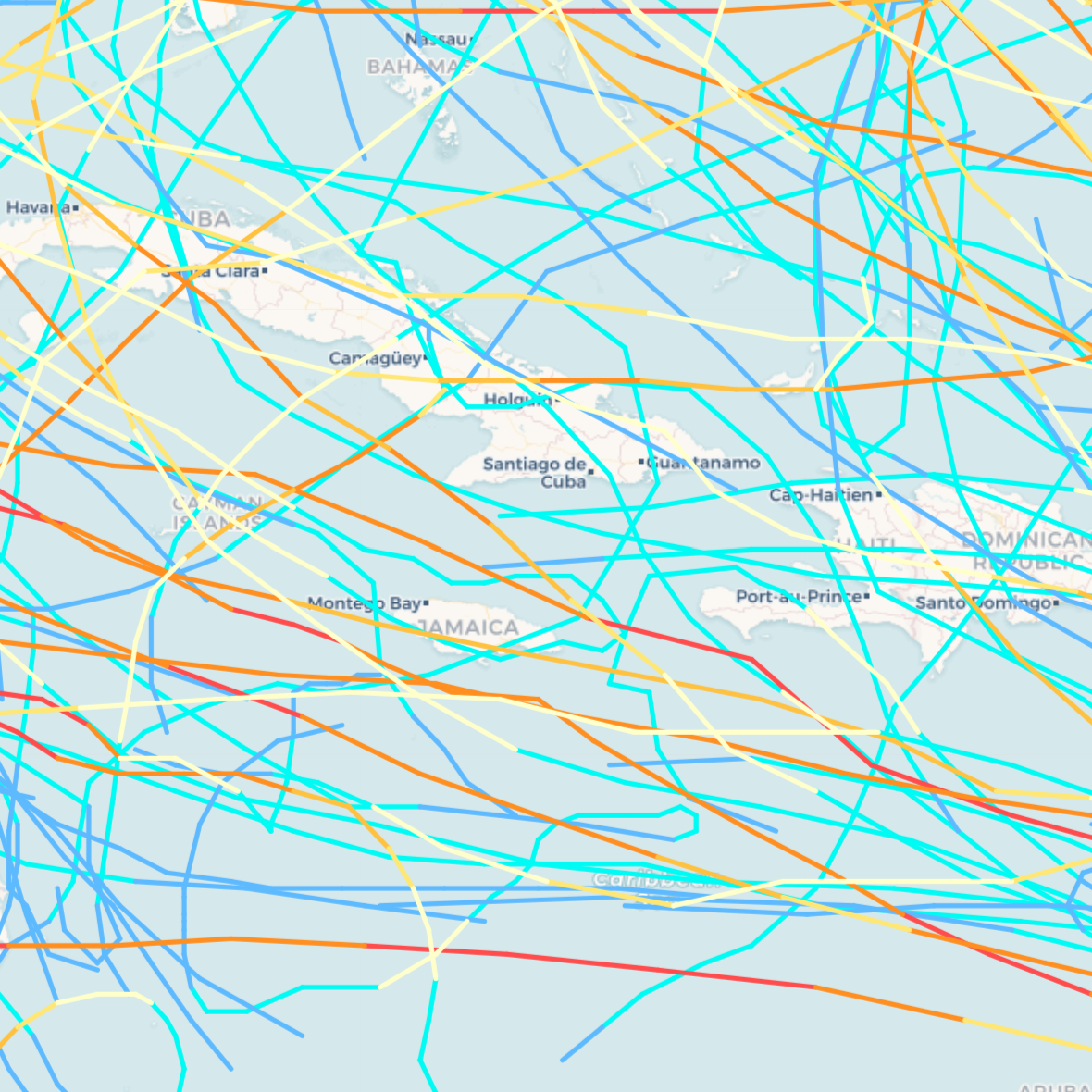
Historical Hurricane Tracks
This map showcases historical North and Central American tropical storm and hurricane tracks since 1980. Storms are classified according to their wind speed, and a single storm can be isolated for further examination by clicking on any segment. Data acquired from NOAA. Map created with Leaflet.
US Power Plants
This map shows power plants in the United States, symbolized by fuel source and fuel capacity in MW. Hover over any power plant to view its capacity as well as the breakdown of fuel sources. Plants are mapped using proportional symbols defined by each plant’s fuel capacity. Power plant data acquired from EIA Form 923. Map created with Leaflet.
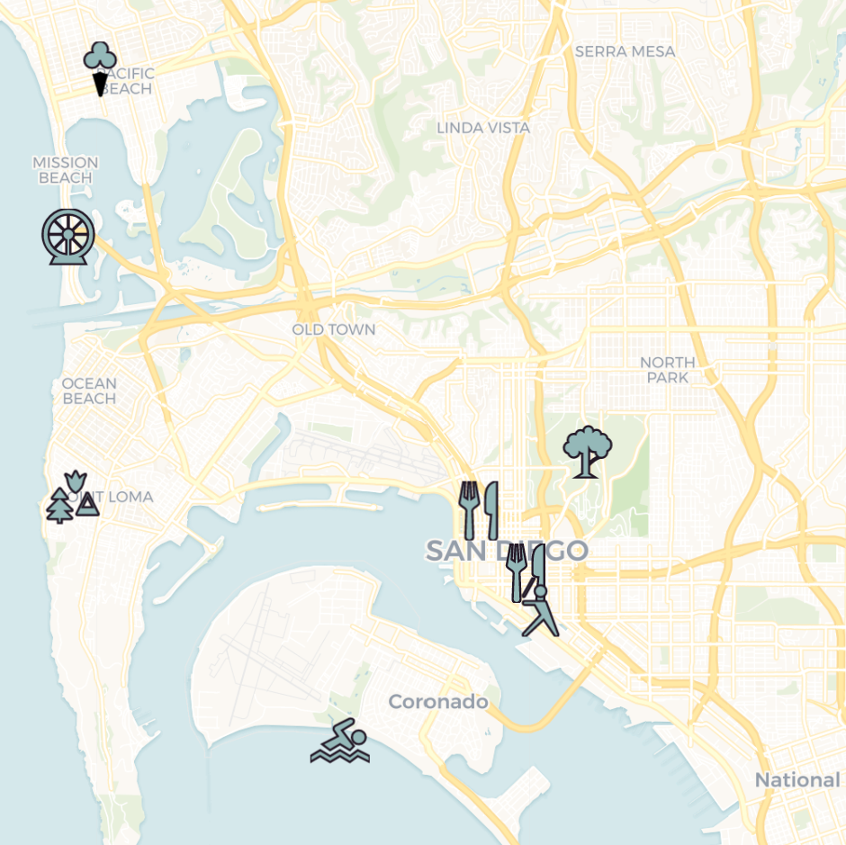
Visit Sunny San Diego!
This map showcases the city of San Diego CA, America’s Finest City! Explore the city by clicking any icon on the map to discover new restaurants, attractions, and natural parks and beaches. Created with Leaflet.
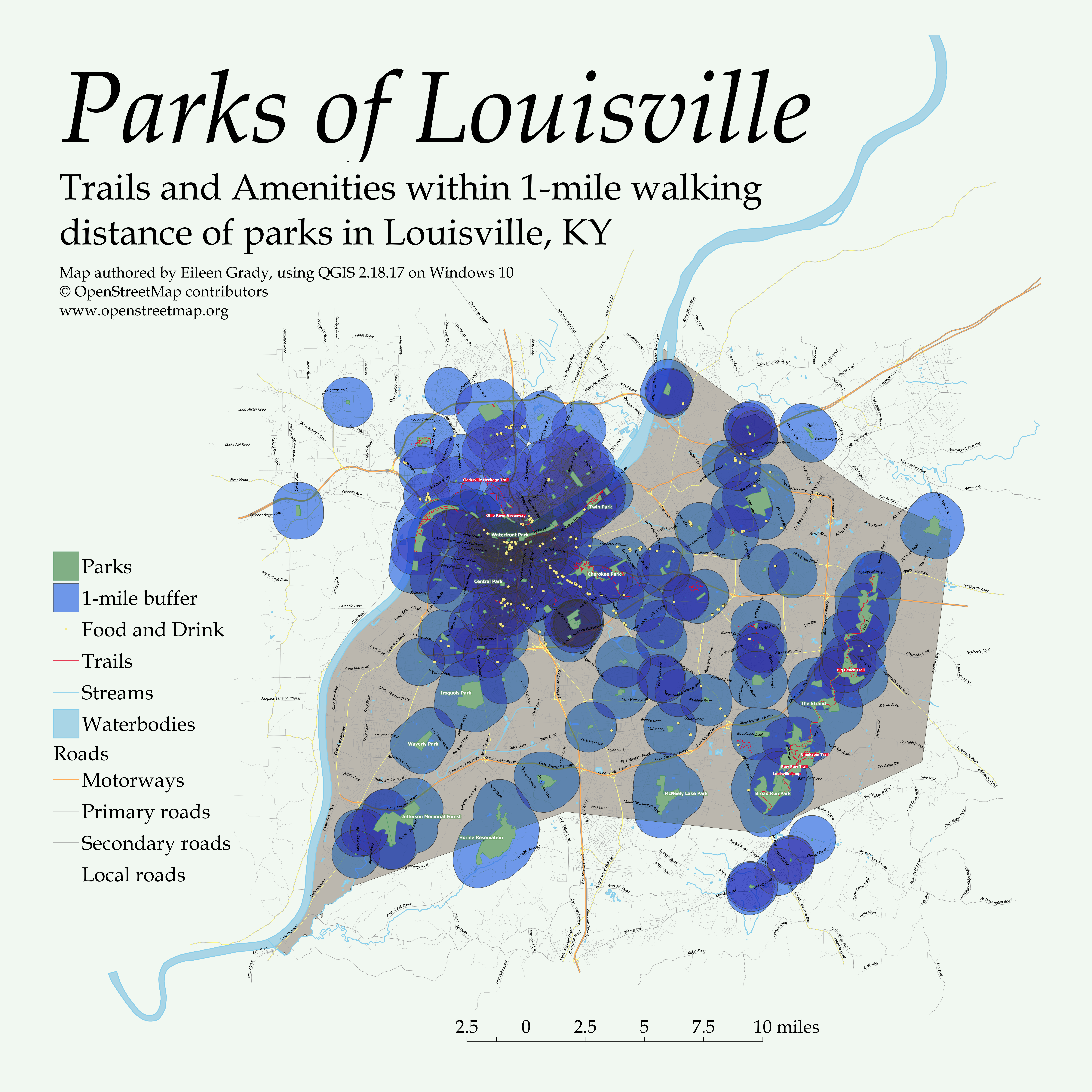
Parks of Louisville
Louisville KY is home to many gorgeous parks, including a park system connected by tree-lined parkways designed by Frederick Law Olmsted. This map shows trails and amenities within 1-mile walking distance of all Louisville parks. All data acquired from OpenStreetMap. Map created with QGIS.
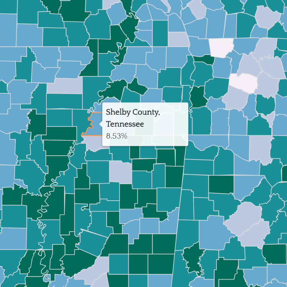
US Educational Attainment
Explore patterns of educational attainment across the US by choosing an education level from a dropdown menu. Data acquired from the US Census and prepared in QGIS. Map created with Leaflet.
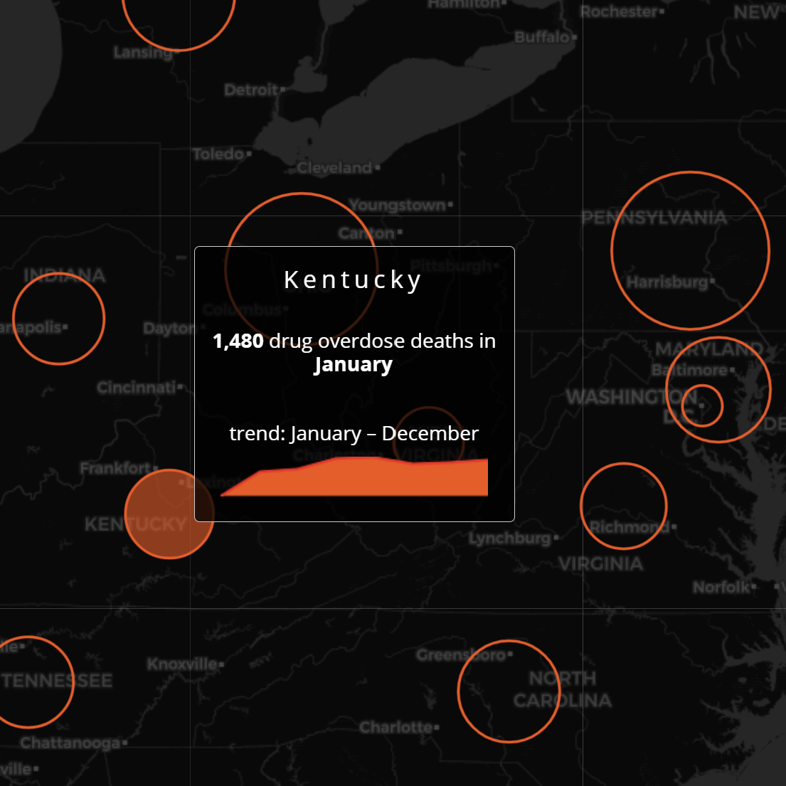
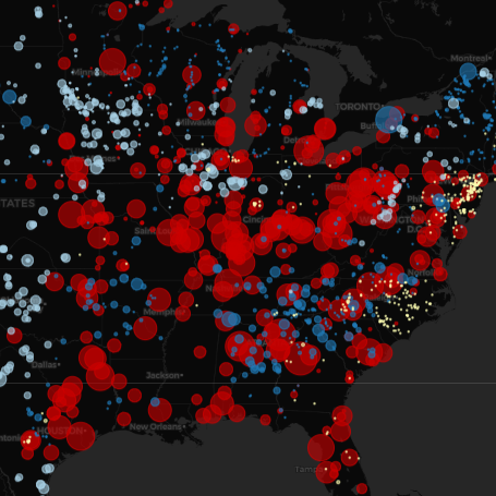
Drug Overdose Deaths in the US
The opioid epidemic contributes significantly to the rising rates of drug overdose deaths in the US. This map employs a time slider and jQuery sparklines to visualize drug overdose deaths each month in 2017 by state. Data acquired from the CDC. Map created with Leaflet.