Judith Tyner first used the term persuasive cartography in 1974. She includes propaganda maps in this category, which carry a negative connotation as tools that deliberately distort facts in order to spread false information. But not all persuasive maps are necessarily considered propaganda. Persuasive mapping occurs in varying degrees and implies “an appeal based on logic or inducement rather than false assertion.” Use the carousel above to choose a persuasive map, then click through the guided tour to explore how each map conveys its persuasive message.
Web-based interactive by Eileen Grady.
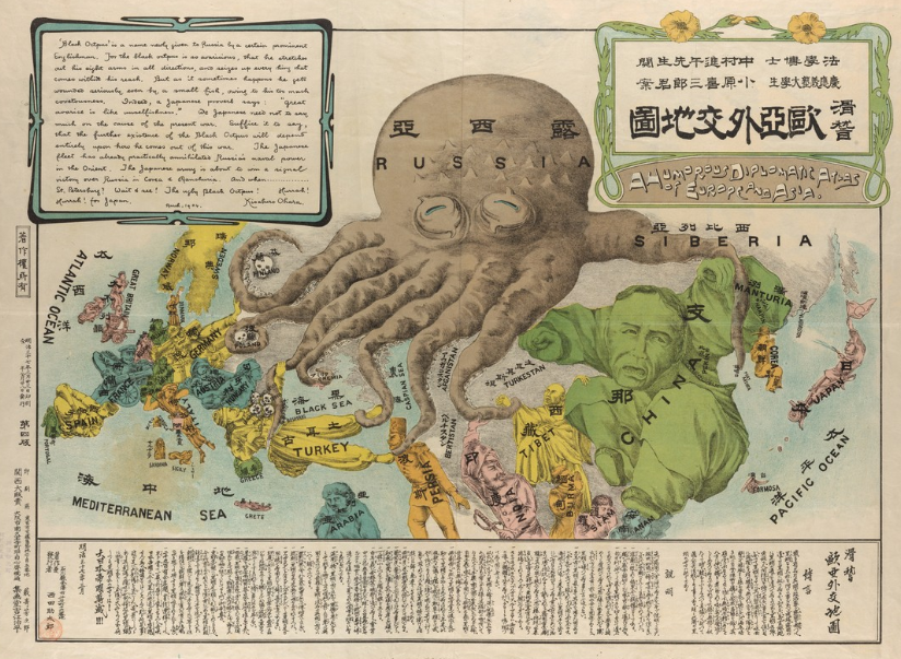
A Humorous Diplomatic Atlas of Europe and Asia
This is an example of a blatant persuasive map that crosses the line into propaganda. The map was created in 1904 during the Russo-Japanese War by Kisaburo Ohara, a student at Keio University in Tokyo. Russia is depicted as an ominous black octopus with its tentacles literally wrapped around the surrounding countries.
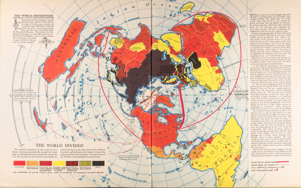
The World Divided
This map by Richard Edes Harrison published in August 1941 is an example of a persuasive geopolitical map. Harrison uses the azimuthal projection to better illustrate the nature of an “air-age war, and persuades the reader with logic to realize the pivotal role that the US plays in WWII.
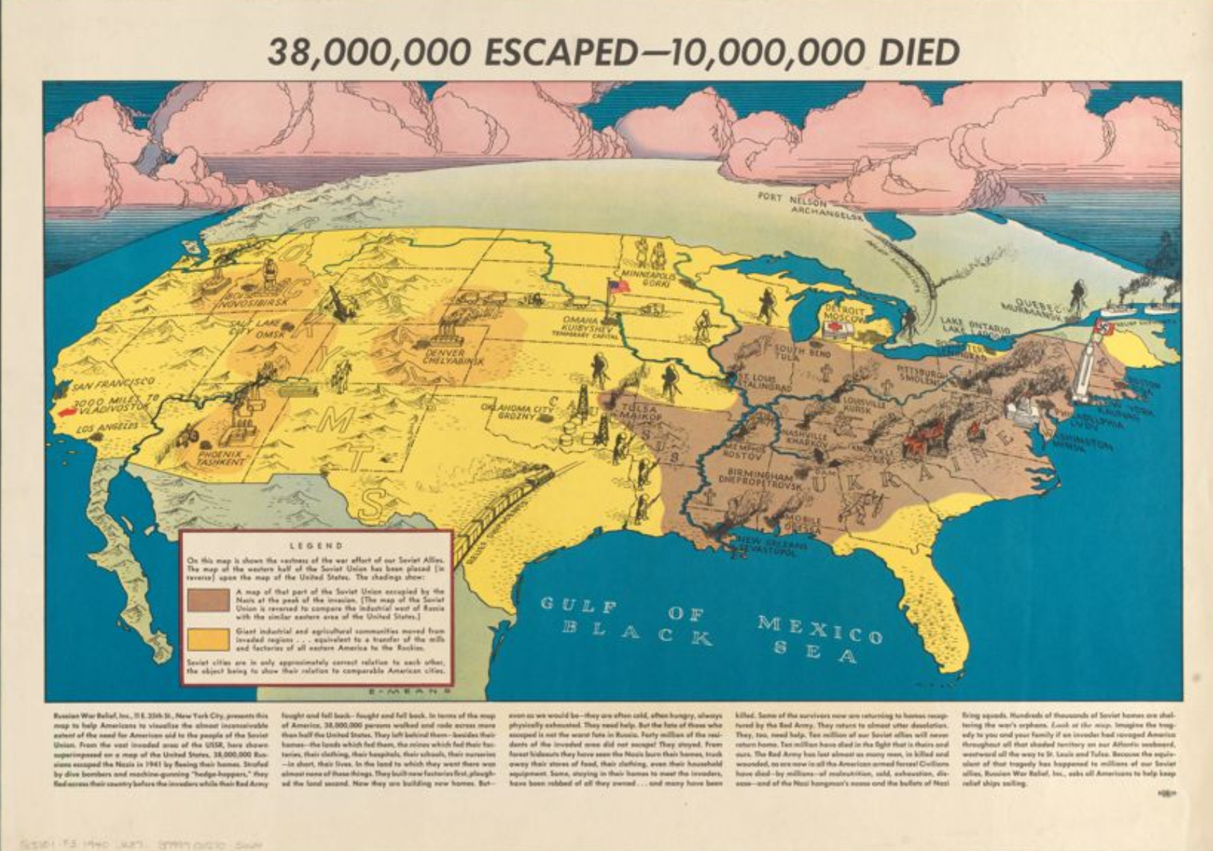
38,000,000 Escaped—10,000,000 Died
This map published by the Russian War Relief in New York City circa 1941 follows a humanistic approach to cartography. The map attempts to persuade the reader with an emotional appeal, to gain support for sending aid to the Soviet Union during WWII.
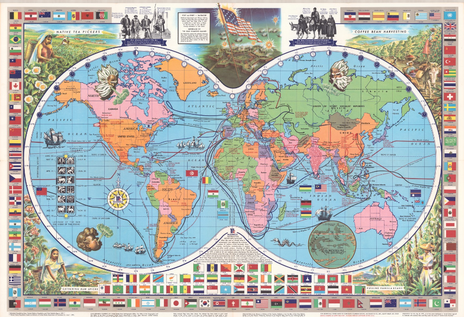
McCormick's Map of the World
This cheery promotional map for the McCormick Spice company was found on the back of a brochure from 1971. Tyner categorizes advertising maps as a form of persuasive cartography. The use of the world map, along with a border of national flags, is used to persuade or convince the reader of McCormick’s status as a global brand.